


Introduction
This article will explain what warehouse heatmaps are and how they help you visualize real-time activity across your facility. We’ll show how to build them from WMS, LMS, and ERP data, and how to use them to improve slotting, travel paths, and labor efficiency. You’ll learn about common pitfalls, how to keep your heatmaps accurate over time, and how Rebus makes it easier to move from static reports to live, actionable insights that scale across multiple sites.
Table of Contents
How data-driven visuals help you see, understand, and improve warehouse performance
Warehouse heatmaps have become one of the most effective tools for uncovering what’s really happening on the floor. By turning raw data from your WMS, LMS, or ERP into color-coded visualizations, warehouse heatmaps reveal inefficiencies that spreadsheets can’t – from congestion zones to underutilized locations and wasted travel time.
But while they may look like “pretty pictures,” the best warehouse heatmaps are built with precision. They aren’t just for analysis – they’re for action. Let’s explore how they work, what data they rely on, how to create them, and how to use them to drive measurable performance improvements.
What Are Warehouse Heatmaps?
A warehouse heatmap visually represents activity or performance data across your facility layout. Each cell or location is color-coded to show how often it’s used, how long items dwell there, or how frequently tasks occur. The hotter the color, the higher the activity or issue density.
Common Types of Heatmaps
- Pick frequency heatmaps: Identify the fastest-moving locations and high-demand SKUs to optimize slotting.
- Travel path heatmaps: Trace the routes workers or forklifts take most often – helping you spot wasted motion and congestion.
- Congestion heatmaps: Highlight where multiple tasks overlap, causing slowdowns and traffic.
- Dwell time heatmaps: Show how long goods stay in a given zone, pointing out potential storage or replenishment delays.
- Exception or delay heatmaps: Visualize where system or process errors most often occur, such as repeated scan exceptions or mispicks.
When to Use Heatmaps vs. Other Visuals
- Use heatmaps when you need to see where something happens.
- Use density maps to visualize storage utilization across zones.
- Use spaghetti (path) diagrams for worker movement analysis.
Each has its place – but heatmaps are uniquely suited for translating warehouse data into operational insight you can act on immediately.
The Data You Need (and the Quality Bar)
TA warehouse heatmap is only as accurate as the data feeding it. To produce a useful visualization, you need consistent, timestamped, and location-specific information from your warehouse systems.
Core Fields
- Location IDs – every pick, putaway, or move event needs a defined physical location.
- Timestamps – start and end times for tasks are critical to measure congestion or dwell.
- User IDs or Equipment IDs – track which associate or forklift completed the action.
- Order or task type – distinguish picking, replenishment, putaway, or audit moves.
Granularity and Refresh
The best warehouse heatmaps update frequently – ideally every few minutes or hourly. Stale data can create false impressions, especially when travel patterns shift by shift or season. Many operators find a rolling 4-8 week window gives the best balance of trend insight and recency.
Governance
If you operate multiple sites, data governance is essential. Standardize how locations, tasks, and users are defined across facilities so that heatmaps are comparable. Otherwise, you risk apples-to-oranges metrics that undermine your analysis.
Book a free demo now
See how Rebus unifies labor, inventory, and automation data to deliver real-time visibility, smarter forecasting, and actionable warehouse insights.
- Real-time visibility across labor, processes, and inventory
- AI-powered forecasting to anticipate change and plan ahead
- Custom dashboards for faster, more confident decisions
How to Create Warehouse Heatmaps
There are several ways to build warehouse heatmaps, ranging from simple spreadsheet models to fully integrated analytics platforms. Each has its advantages – and its limitations. Below we’ll lay it out for an easy side-by-side comparison.
| What you need | Rebus Warehouse Maps | WMS Heatmaps | Power BI/Tableau | Excel |
| Real-time View | ✔ Live, continuous visibility | Mostly delayed snapshots | ⏳ Hourly/daily refresh | ❌ Manual & outdated |
| Cross-system Data | ✔ WMS + other systems | ❌ WMS-only | ⚠ Possible but complex | ❌ No |
| Map Builder | ✔ Drag-and-drop warehouse maps | ❌ Rigid layouts | ⚠ Custom visuals needed | ❌ Not possible |
| Actionable Drill-down | ✔ Click zones → see tasks, users, shifts | ❌ Minimal detail | ⚠ Requires heavy modeling | ❌ None |
| Multi-site at Scale | ✔ Standardized maps across all DCs | ❌ Each site looks different | ⚠ High governance burden | ❌ Not scalable |
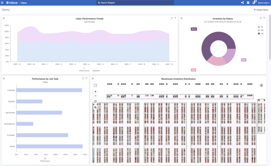
Rebus is purpose-built for these kinds of analytics. It integrates data from multiple systems and visualizes performance live across every site. That means you don’t just see what’s happening – you can act on it right away.
Reading the Map: From Color to Decisions
A well-built heatmap tells a story. The key is interpreting that story correctly – and translating colors into changes that improve performance. Tools like Rebus Warehouse Maps make that process even more intuitive by letting you visualize and drill down into your live warehouse data, seeing every activity flow in real time.
Slotting and ABC Analysis
Use pick-frequency heatmaps to validate your slotting strategy. Are your “A” movers actually in the most accessible locations? Could shifting even a handful of high-volume SKUs reduce travel distance by double digits?
For example, a facility might see 40% of all picks concentrated in just 10% of locations. By reslotting those SKUs closer to packout or cross-dock zones, operators can reduce total travel time by 15-20%.
Travel and Congestion
Travel-path and congestion heatmaps often reveal unplanned chokepoints – like shared intersections or staging areas that become crowded during wave launches. Adjusting start times or rerouting tasks can help eliminate these hidden slowdowns.
Labor Moves and Staffing
Heatmaps show not only where tasks occur but when. Overlaying shifts can highlight peak-hour congestion or idle zones. This helps you balance workloads and improve lines per hour by reallocating staff.
Safety and Damage Hotspots
If you overlay incident data – such as near-misses, damages, or equipment alerts – your heatmaps can become a safety tool, too. Hot zones for damage or congestion often overlap, showing where layout tweaks can reduce risk.
A 7-Step Heatmap Workflow (Repeat Weekly)
- Define the question. What problem are you solving – e.g., “reduce travel 12%” or “cut congestion at dock 3”?
- Pull recent data. Use the last 4-8 weeks of tasks, excluding anomalies or exceptions.
- Build or refresh the heatmap. Ensure data aligns with your latest layout.
- Apply filters. Separate shifts, weekdays, or task types to isolate trends.
- Identify hot cells. Focus on the top 10% of activity areas and quantify the impact.
Repeat this process regularly. A warehouse heatmap is most valuable when it evolves alongside your operations.
- Implement changes. Reslot items, reroute paths, or adjust labor allocation.
- Track before/after. Monitor results for two weeks, lock in improvements, and iterate.

Multi-Site Playbook
For companies managing multiple DCs, standardization is the key to scaling insight. Define a consistent data model for location IDs, task types, and KPIs so that every facility’s heatmap can be compared directly.
With centralized analytics, you can:
- Benchmark travel time or congestion minutes across sites.
- Identify top-performing layouts or slotting strategies.
- Replicate successful process changes globally.
Rebus Warehouse Maps make it possible to visualize and compare those layouts side by side – with live updates, unified data, and interactive, customizable maps for every facility.
Hypothetical Example Scenarios
- A consumer goods distributor uses travel-path heatmaps to reduce average picker travel by 18% by relocating high-frequency items closer to primary aisles.
Each example demonstrates how heatmaps convert warehouse data into operational advantage – when they’re done right.
- A 3PL handling seasonal e-commerce peaks refreshes its congestion heatmaps daily, adjusting labor deployment and staging zones to keep throughput stable.
- A multi-site retailer uses Rebus to standardize its heatmap templates, allowing each DC to compare travel time, lines per hour, and congestion minutes on the same scale.
Avoid These Pitfalls
Even the best tools can mislead if used incorrectly. Watch out for these common mistakes:
- Pretty picture bias: Don’t stop at the visual. Always quantify what the “hot zones” mean in minutes, steps, or dollars.
- Stale data: Outdated heatmaps can drive the wrong decisions, especially during peak season.
- Wrong scale: If your map’s color scale isn’t standardized, two similar facilities might look vastly different.
- Ignoring off-aisle time: Not all inefficiencies happen on the pick face – consider staging, waiting, and travel between zones.
The takeaway: a warehouse heatmap should be actionable, not decorative.
How Rebus Makes Heatmaps Actionable
Rebus turns warehouse heatmaps into interactive, data-driven Warehouse Maps that help operators see what’s happening in real time – and take action fast. Instead of manually combining data from multiple systems, Rebus integrates directly with your WMS, LMS, and ERP to visualize warehouse activity as it happens.
With Rebus Warehouse Maps, you can:
- Visualize real-time operations – track inventory levels, workflow statuses, and space utilization on a live, interactive map.
- Customize your layout – use a flexible drag-and-drop editor to design maps that reflect your facility’s zones, SKUs, or operational priorities.
- Spot inefficiencies instantly – color gradients and data overlays make bottlenecks, congestion, and underutilized space obvious at a glance.
- Drill down for insight – click any mapped area to see detailed data filtered by activity type, shift, or location.
- Integrate seamlessly – Rebus connects with your WMS and other systems to provide a unified, real-time view of performance across your network.
By combining the analytical depth of warehouse heatmaps with the intuitive design of Warehouse Maps, Rebus gives your team a powerful way to improve efficiency, reduce travel time, and optimize space – all from one interactive dashboard.
Conclusion and Next Steps
Warehouse heatmaps aren’t just for analysis – they’re the foundation of a smarter, more responsive warehouse. With the right tools, you can move from static charts to dynamic, real-time visibility that drives continuous improvement.
Rebus Warehouse Analytics and Warehouse Maps work together to give you that visibility. Rebus transforms raw WMS, LMS, and ERP data into clear, interactive visuals that show exactly how your warehouse operates – right now.
See every zone, order flow, and bottleneck in real time. Drill down for deeper insight. Then act immediately to optimize layouts, workflows, and staffing.
Rebus turns color into clarity – and clarity into action.
FAQs about Warehouse Heatmaps
- What is a warehouse heatmap in simple terms?
It’s a visual representation of warehouse activity, showing where work happens most frequently or where bottlenecks form.
- Which types of warehouse heatmaps are most useful?
Pick frequency, travel paths, congestion, dwell time, and exception heatmaps are the most common.
- How do you create warehouse heatmaps from WMS/LMS data?
Extract task and location data, map it to your layout, and color-code activity frequency or duration. Rebus can automate this process in real time.
- Can I build a heatmap in Excel or Power BI?
- Yes, though these methods are static and best for analysis snapshots. For ongoing visibility, use an analytics platform integrated with your WMS.
- What data fields are required?
At minimum: location IDs, timestamps, task types, and user IDs.
- How often should warehouse heatmaps refresh?
Ideally every shift or daily for high-volume operations – or continuously with live analytics tools.
- How do heatmaps inform layout and labor changes?
By highlighting congestion or overtravel zones, enabling data-backed reslotting and staffing adjustments.
- What mistakes should I avoid?
Don’t rely on static visuals or misaligned data. Always validate what the “hot zones” represent.
- How can multi-site operations standardize and compare heatmaps?
Use consistent data structures and centralized analytics – Rebus enables this across your network.